Stay
updated.

Stay ahead of the curve with Depot. Join our newsletter to get the latest design trends, industry insights, and creative inspiration delivered straight to your inbox. Don’t miss out—sign up today!

Thank you! You're signed up.
Oops! Something went wrong while submitting the form.
Close

Depot was engaged to lead a full identity refresh. The objective was clear: preserve Suminter’s deep agricultural heritage while building an identity that reflects its modern ambition, global reach, and future-forward values.

The Strategy: Rooted in Soil, Focused on Progress.

We began by distilling the brand’s essence—grounded in soil, people, and shared progress. The goal was to bring clarity to the brand architecture while expressing its founding values of responsibility, community, and care through a more contemporary visual language.

The Design: Where Tradition Meets Momentum.

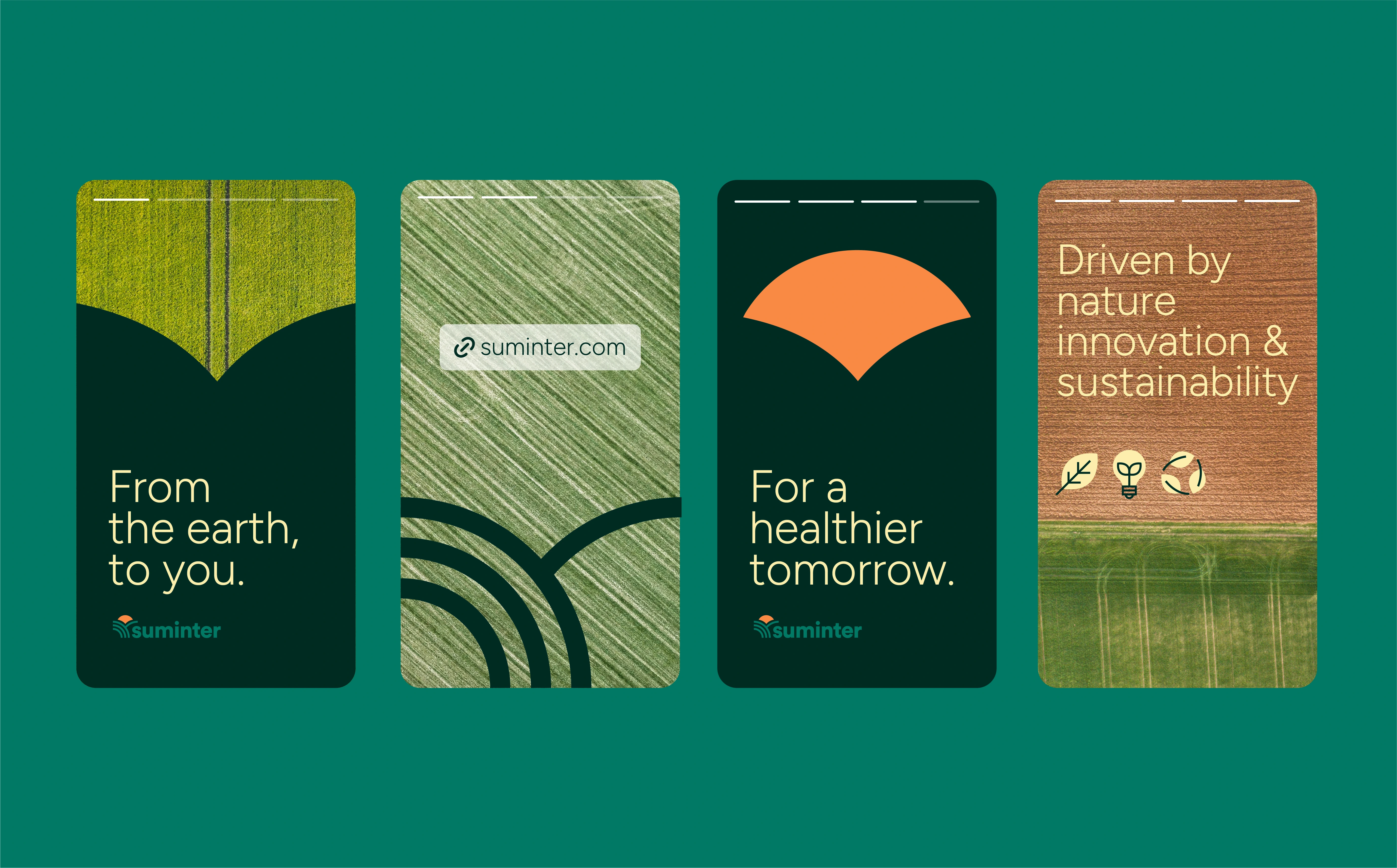
The refreshed identity is led by a new symbol—three arcs on the left represent the stages of growth: planting, nurturing, and harvesting. A single arc on the right points forward, symbolising the brand’s singular focus on opportunity and innovation. Framed by a rising sun, the mark signals progress, renewal, and abundance.

Together, these elements form a narratively rich logo that feels both grounded and aspirational—reflecting Suminter’s evolution from local pioneer to global partner in sustainable agriculture.

The wordmark complements this balance. Geometric, structured, and warm, it’s designed to feel contemporary without losing its connection to the land.

The colour system shifts from monochrome to something more expressive and elemental. Earthy terracotta, forest green, sunlit yellow, and clear-sky blue draw from the natural world Suminter is rooted in—while adding shelf presence, digital flexibility, and global distinction.

The Result:

From packaging to partnerships, the refreshed brand identity is a flexible system designed for scale. Suminter now has the tools to grow—with clarity, confidence, and purpose.

Suminter

From refined roots to vibrant growth.

A brand evolution grounded in origin, made for scale.

As a pioneer in sustainable organic agriculture, Suminter has spent more than two decades connecting Indian farmers with global markets. But as the business expanded—diversifying its offer, entering new categories, and reaching new audiences—it became clear the brand needed to evolve.

Depot was engaged to lead a full identity refresh. The objective was clear: preserve Suminter’s deep agricultural heritage while building an identity that reflects its modern ambition, global reach, and future-forward values.

The Strategy: Rooted in Soil, Focused on Progress.

We began by distilling the brand’s essence—grounded in soil, people, and shared progress. The goal was to bring clarity to the brand architecture while expressing its founding values of responsibility, community, and care through a more contemporary visual language.

The Design: Where Tradition Meets Momentum.

The refreshed identity is led by a new symbol—three arcs on the left represent the stages of growth: planting, nurturing, and harvesting. A single arc on the right points forward, symbolising the brand’s singular focus on opportunity and innovation. Framed by a rising sun, the mark signals progress, renewal, and abundance.

Together, these elements form a narratively rich logo that feels both grounded and aspirational—reflecting Suminter’s evolution from local pioneer to global partner in sustainable agriculture.

The wordmark complements this balance. Geometric, structured, and warm, it’s designed to feel contemporary without losing its connection to the land.

The colour system shifts from monochrome to something more expressive and elemental. Earthy terracotta, forest green, sunlit yellow, and clear-sky blue draw from the natural world Suminter is rooted in—while adding shelf presence, digital flexibility, and global distinction.

The Result:

From packaging to partnerships, the refreshed brand identity is a flexible system designed for scale. Suminter now has the tools to grow—with clarity, confidence, and purpose.

No items found.
No items found.
Expertise:
strategy + positioning
brand guidelines
brand guidelines
Visual Identity System
artwork
artwork
Awards:
No items found.
No items found.
https://player.vimeo.com/progressive_redirect/playback/1086305313/rendition/1080p/file.mp4?loc=external&signature=5020cbd1968ea208978a2307d55a47d461f16031e11d9193e7b7d7a162403226
https://player.vimeo.com/progressive_redirect/playback/1086304614/rendition/1080p/file.mp4?loc=external&signature=edb07cfe826f840cc239b7fca6c43c2981dbafe44d237d387c86996d4b1cd80a
4
6

Evolving business. Outgrown brand identity?
Let’s fix that.