

How to design packaging for healthy snacks
Packaging design for healthy snacks: 4 top tips
The snack market is changing. And so is the way we eat.
While the traditional eating patterns of 3 structured meals remain, we’re snacking more frequently. Millennials are the most likely to succumb to snack attacks – they’re snacking 4 times a day! So, what does this mean for packaging design for snack foods? Let’s take a look at that shortly. First, let’s consider current trends a little more.
Once upon a time you had to really search out and go to ‘specialty health food’ stores to find unrefined ‘natural’ products. Now our supermarkets have dedicated aisles catering to our growing allergies and intolerances. What was once ‘hippie food’ is now mainstream staple – chia seeds anyone?
What’s more, we like to be seen to be eating healthily. We want to post images of our afternoon Japanese turmeric-matcha-latte while we enjoy snacking on our gluten free, vegan plant protein.
As consumers turn their backs on sugar-loaded, empty snacking, there will be a flurry of products that will fill the healthy space, from plant protein to bug protein.
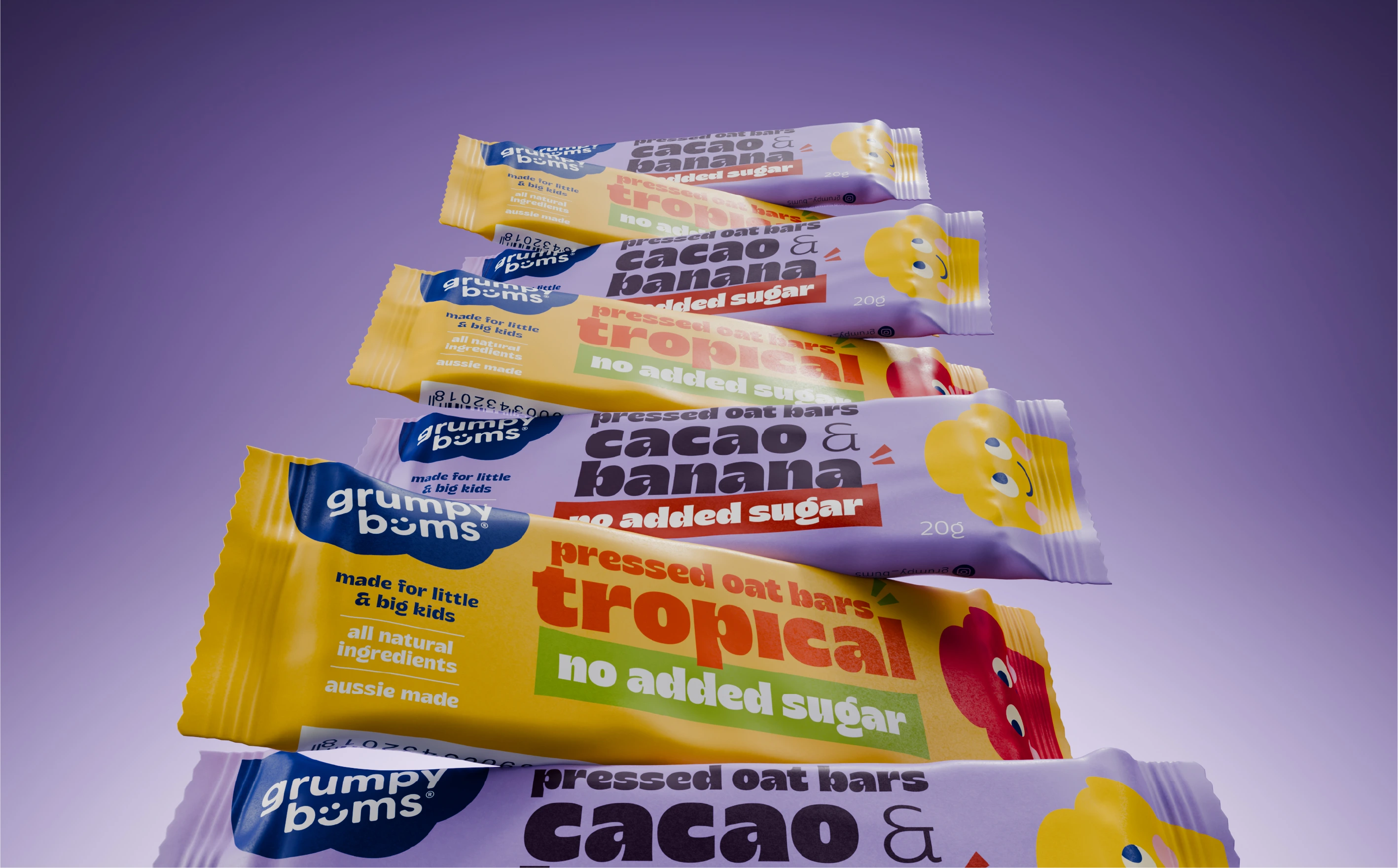
Packaging design for snack foods needs to reflect consumers’ concerns around health and make it super easy for people to evaluate what products do and don’t contain. They’re craving simple, recognisable ingredients. They’re looking for purity and authenticity. They want natural and nature.
So here are 4 things to consider when packaging healthy snacks:
1. Simplicity - Clarity of hierarchy
Cut to the chase. Simplify the message through clear, structured packaging hierarchy. Thankfully we’ve moved on from the 80’s washing powder trend of loading the front of packs with as many features and benefits as possible, all shoe-horned in to one small space. However, don’t confuse simplicity with minimalism. Simplicity captures essentialism. And that is key, particularly in this category which is crowded and often confusing.
Natasha’s Kale Crunchies by Dynamo is a delightful example of healthy, raw natural food captured beautifully, simply and personally. For me, this snack’s packaging passes the ‘at a glance test’—I can see what it is, what’s in it and what’s not. It oozes appetite appeal and I get the feeling that Natasha is fun and passionate about her product. This packaging has been cleverly carved-up in to 4 essential pieces of content: Brand, Product, Benefits and Flavour.

- BRAND: Announcing the brand in a gentle, handwritten font, supported by a playful orange-haired mascot, tells us a lot about the company. The brand is evident on the pack, but doesn’t over power.
- PRODUCT: The product name is large and confident. The letterpress style gives it a sense of ‘handmade with care’. And the product’s wholesome, untainted ingredients are captured through crisp product photography. They look vital, fresh and good for me.
- BENEFITS: The benefits are identified well through clear iconography.
- FLAVOUR: The flavour is identified through bold and energetic colour. Not only does it help differentiate the range, it has great shelf-shout.
In summary, the packaging architecture is well considered and the content hierarchy spot on. There is a very linear structure to the layout which makes it easy to visually digest.By contrast, I find this healthy option by The Funky Monkey, well, just a bit too funky. It’s a smorgasboard of fonts and I found it hard to decipher what the product actually is. This snack food packaging design also delivers 4 pieces of content, but in such a fragmented way. There is no obvious architecture or hierarchy. The elements are competing with each other, rather than complementing and informing. Alone, if we look at where the ‘benefit’ content is placed, you can see it has a less structured, more random approach. This type of hierarchy makes the pack less appealing because it’s difficult to visually digest.

2. Short sentences, succinct wording
Coupled with a well considered hierarchy, it’s important to use clear, unambiguous language. We crave short sentences that get to the point. Our busy lives don’t allow for rambling poetic prose or confusing content. The Hippeas brand is a wonderful example of this with short, informative text: “Sweet and Smokin’” – oh yeah! Or the Gaea fig bar with 6 ingredients—that’s all I need to know unless I do have a moment to suck up the contents of the Nutritional Information Panel.


3. Colour – More than beige
Just because it’s healthy doesn’t mean it needs to have all hessian hues. The snack category lures us with flavour sensations. And millennials have a large appetite for flavour adventures. They enjoy bold and spicy flavours and culturally diverse options. These qualities translate well through hearty typography and luminous colour palettes. You can be bold!
We recently completed a branding and packaging design project for an ancient superfood—lupini beans. This monstrously, moreish, unbelievably good-for-you snack not only delivers on health benefits, it has some cracking flavours like aromatic oregano and tangy turmeric. We decided to use colour to flaunt the flavours and give the packaging some real shelf- shout. But before we were even thinking about stand-out or good blocking, Mother Nature had already paved the way. The flowering lupini plant has an extraordinarily vibrant colour palette, so it became our source of inspiration.

4. Packaging formats – Convenience on the move
The packaging format is key to its success. When it comes to snacking, we are more likely to be on the move than settled. So it is vital to offer an experience. We must understand how consumers engage with the food and the shareable aspect of snacking. Clearly a favourite amongst consumers for its convenience is the pouch format. Below are some great examples of shareable snacks using this approach.


There are multiple opportunities for companies to connect with consumers around new, flexible eating styles and equally some innovative ways of packaging them.
If you’re planning packaging design for snack foods and want to munch through your packaging potential, give me a call on 02 9519 991 or send me an email.

