

Why road signage is a source of inspiration for packaging design.
Utilitarianism
With essentialism at the heart of current packaging design, it led me to think about how we packaging designers source our inspiration in amongst a tapestry of content and stimulus. I looked beyond my packaging horizon, and threw myself back to when I dreamed of being a cartographer in order to peer through the lens of other design disciplines. To look for similarities or borrowed principles in a quest to harness new insights and maybe discover the fringe of a new trend or at least the refresh of a past wisdom.
Utilitarianism—there we have it. I can’t help feeling we’re experiencing a type of re-birthing of this philosophy as brands seek to make more of us happy through storytelling and meaningful connections, through giving back and saving the planet. But if we take a closer look at utilitarian design, I believe there are some recent packaging beauties that have massaged these principles to deliver a fresh new aesthetic.
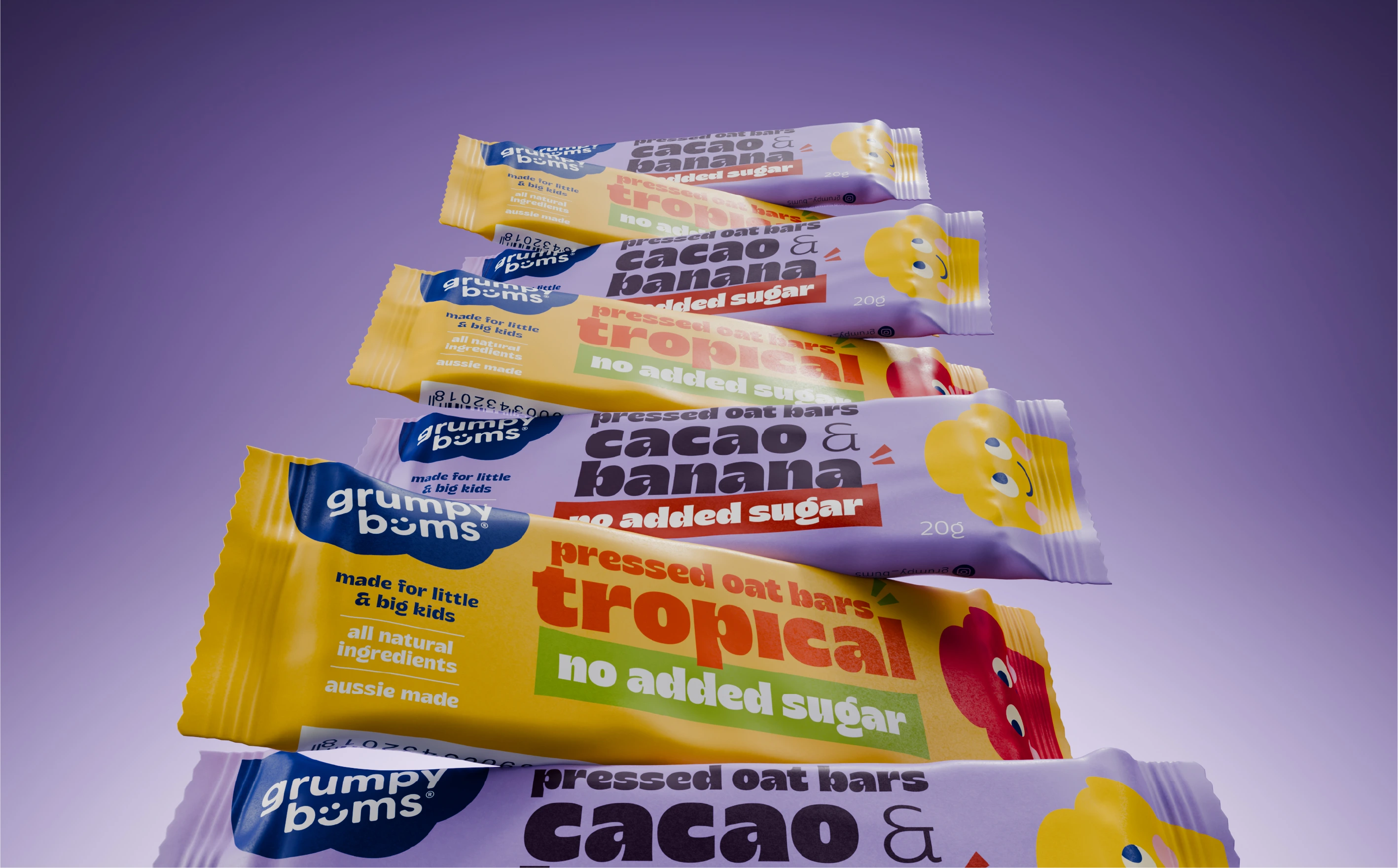
I won’t dissect the entire utilitarian design movement, but I have instead selected a discipline that for me epitomises the ideology—road sign design. More specifically, British road signs. As a Brit, how could I not find beauty in the running deer or the charm of the train station sign? In understanding the design process employed by both Jock Kinneir and Margaret Calvert I was able to find a clear alignment with some current packaging design expressions. (I should add that here I am only referencing surface graphics and not the packaging form.)
In the late 1950’s early 1960’s Kinneir and Calvert devised a signage system artfully composed of co-ordinated lettering, colours, shapes and symbols. They created a sleek, modern, universal, time-enduring language which was uncluttered and distinctive. The following example by the extraordinary design team at Mousegraphics beautifully captures this in their recent work for the skincare brand Asarai.

What I like about the Asarai brand is not only the use of the blazing yellow, not dissimilar to the retro-reflective road signs that leap out at you—bold in a category that often opts for white or subdued tones. But also, the fractured abstract type—this in turn reminded me of the wonderful artworks by Rosalie Gascoigne where she re-purposed discarded road signs into powerful assemblages. She discouraged the viewer to read meaning in to these abstract images but instead to focus on ‘the pleasure of the eye’.
Similarly, Mousegraphics work for GAEA vegan snacks uses these playful pictograms that express personality, much in the same way that Calvert depicted her pictograms—the cow on the animal and livestock sign was modeled on ‘Patience’ a cow from a friend’s farm.

In addition, their work for the espresso brand 96 is truly universal and as always, clever. The sultry colour palette and the evocative steam, fill us with the smell and taste sensation of robust coffee beans. Their witty abstract depiction of ‘96’ that doubles as espresso cups brings a smile. This is packaging that in the words of Lewis Moberly ‘first wins the eye, then the heart, then the mind’.

But in coming back to the approach by Kinneir and Calvert, their task from an information design perspective was to devise a system which would be as easy to read and understand as possible. Kinneir started with the question ‘What do I want to know, trying to read a sign at speed’. I think as packaging designers, we should be asking ourselves the same question as consumers race around supermarkets, time poor, over-saturated and overwhelmed. And our on-line experience is not without distractions either. How can you reduce the appearance to make the maximum sense? One of the best examples of this comes from JKR with their packaging for Domino’s pizza. It is truly iconic.

As we have become an over communicated society I believe these designs serve our bulging, supersaturated minds—less really is more. A sharp, simplified message has the ability to cut in to the mind and the potential to make a lasting impression.
I am pleased that my dream to be a cartographer never came true. Packaging design today is dynamic, complex and ever shifting and with each new project we are set new challenges and presented with ever-greater opportunities. So, let’s get on with creating the next new paradigm.
If you’d like to chat through a project you have in mind, give me a call on +61 2 9519 9991

