
Part 01. My Journey Through Packaging Design.
Part 1: Old Spice.
Foil stamping, flint collections, and finding my way in a man’s world.
I never imagined that the little girl who kept all her toys in their original packaging - not for resale, but so she could have a brand moment every time she played - would grow up to build a career re-imagining how products connect with people around the world. But here we are.
The Seeds Were Planted Early.
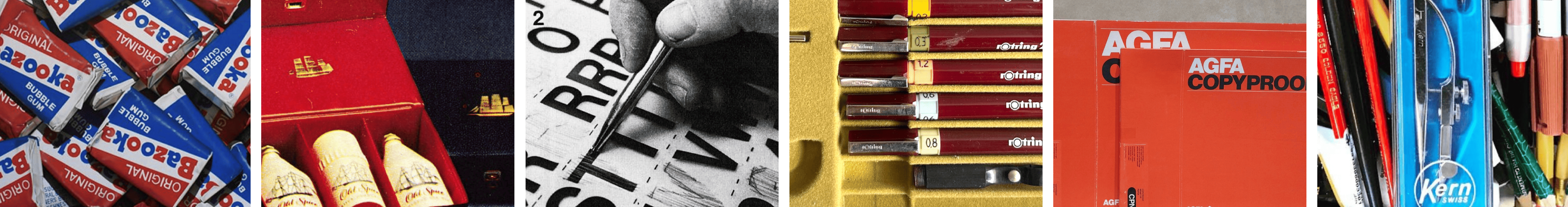
It started with an Old Spice travel pack - blue and red vinyl, brass twist-lock closure, gold foil stamping. Technically meant for soap or aftershave, but to me, it was the perfect vault for my flint collection. The box carried the scent of ‘The Mark of a Man’ - which, at the time, seemed to apply to everything: advertising, design, leadership, even the tools on your desk. I didn’t know it then, but that box was a signal. Not just of what I loved - the structure, the finish, the quiet power of presentation - but of the world I was walking into. A world where the work, the studios, the awards were all marked, quite literally, by men.
Still, I kept that box. Not for what it was meant to hold, but for what it represented: that even within a system where the rules had already been written - and not by women - design had room for obsession, for detail, for reinvention. And I was ready to make my own mark.
That Old Spice box wasn’t a one-off. It was the beginning of a pattern. One that would shape how I saw everything. While other kids tore into sweets without a second thought, I was carefully peeling back wrappers and filing them away like rare artefacts. I admired the Bazooka Joe comic strips, was transfixed by the Spangles logo, and could spend an afternoon studying the structural genius of the paper wrap on a Barratt's Sherbet Fountain.
Everything had its place. Its purpose. Its perfectly designed container.
My first love wasn’t Helvetica - it was packaging.
But type came a close second. Banging out my name on our family’s Olivetti typewriter (in all caps, red ribbon) sparked a mild obsession with letter forms. That detour into typography landed me my first paid commission at sixteen: hand-lettering graduation certificates for Oxford University.
While my peers were doodling band logos on their folders or making mix-tapes, I was perfecting my Old English Gothic flourishes on parchment.
Breaking Into a Male-Dominated Industry.
At eighteen, I was commuting into London to work as a paste-up artist - a job I stumbled into after sidestepping an interview for an apprentice printer role. The printing floor was a testosterone sauna: plastered with Pirelli calendars and thick with the pungent fug of solvent. Luckily, someone thought I was better suited to the ‘studio,’ and just like that, I was in.
It was a baptism by solvent and scalpel. I learned fast. I had to. Casting off type, splicing headlines, building halftones on a bromide machine. None of it was glamorous. None of it was easy. I learnt to kern type by hand - that’s aligning letters with white-space precision - and to spot a poorly spaced word from across the room, a habit that’s hard to shake: I can’t sit in traffic without wanting to fix bus backs and billboards.
From the paste-up bench to prescription brands - the transition was oddly seamless. From there, I moved into a pharmaceutical ad agency, where I quickly discovered that if you want to photograph suppositories, you put them in the freezer first.
The glamour didn’t stop there. No Photoshop. No AI. Just rubylith film, a scalpel, and a very steady hand - once tasked with “sweetening up the curves” (Art Director’s actual brief) of a bikini-clad woman lounging on a makeshift beach we built in-house with piles of sand. (We’d later hand-comp her into a film shot of a beach in Mauritius - where said Art Director had recently holidayed.)
They dreamed in broad strokes. I handled the hairlines. Letraset, headline type, and whatever they'd sketched on a napkin - all rebuilt by hand. With my Rotring pens and a loyal band of Rotring Romeos, we turned fantasy into finished art.
If that sounds like design nostalgia, it was anything but soft-focus. Born post-2000? Imagine building a layout pixel by pixel - except every pixel is a hand-cut sliver of paper from an illustration you’ve drawn, and your undo button is a blob of sticky Cow Gum. If you know, you know.
It was within this painstaking craft that my eye for detail was honed. I still recall the Creative Director handing back one of my carefully composed headlines with a simple remark: “Too much space between the K and the O.” That brief comment became a lasting lesson in kerning - quietly delivered, permanently lodged.
Three decades on, I still can’t walk past an ad or a poorly spaced sign without wanting to fix the type. Rivers. Rogue letter spacing. Widows. Crimes against kerning. Once you see it, you can’t unsee it.
And I thank those early years for training my eye, sharpening my instincts, and teaching me that the devil really is in the detail.
From Alka Seltzer to the Australian Ballet, my design adventures carried me across the globe - overland through Southeast Asia to Australia - where the studios were sun-soaked, the pace was looser, and the opportunities were wide open.
I moved between sectors and scales. From Cinzano mixers, the Rosemount Diamond Label, and Qantas interiors to the winged NRMA brandmark, - adapting to new cultures, mastering fresh codes, and leaving my mark on brands that were household names.
Next in Part 2: From Studio Floors to Executive Floors.
A young ‘female’ creative in the boardrooms of Bosch, shaping brands at scale. I stepped into the world of global branding - where budgets ballooned, expectations soared, and egos were unavoidable. What followed was a career defined by challenging existing thinking, conscious creativity, and consistently delivering powerful commercial outcomes. Stay tuned.

