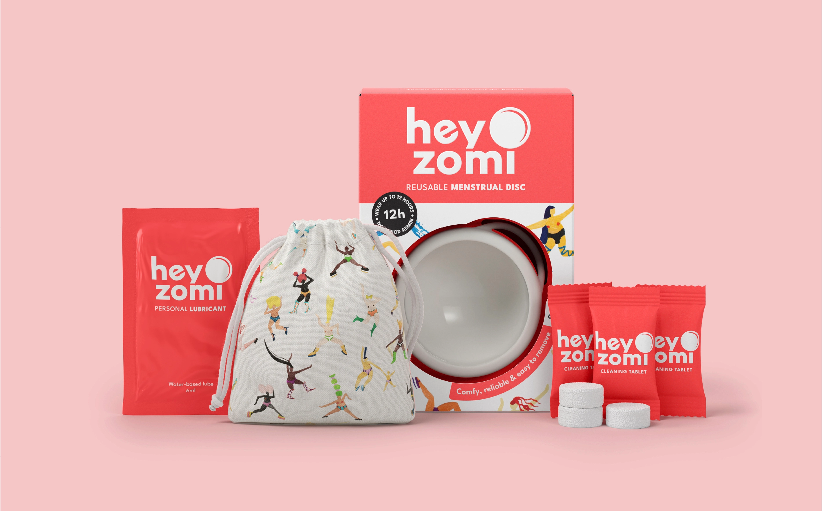
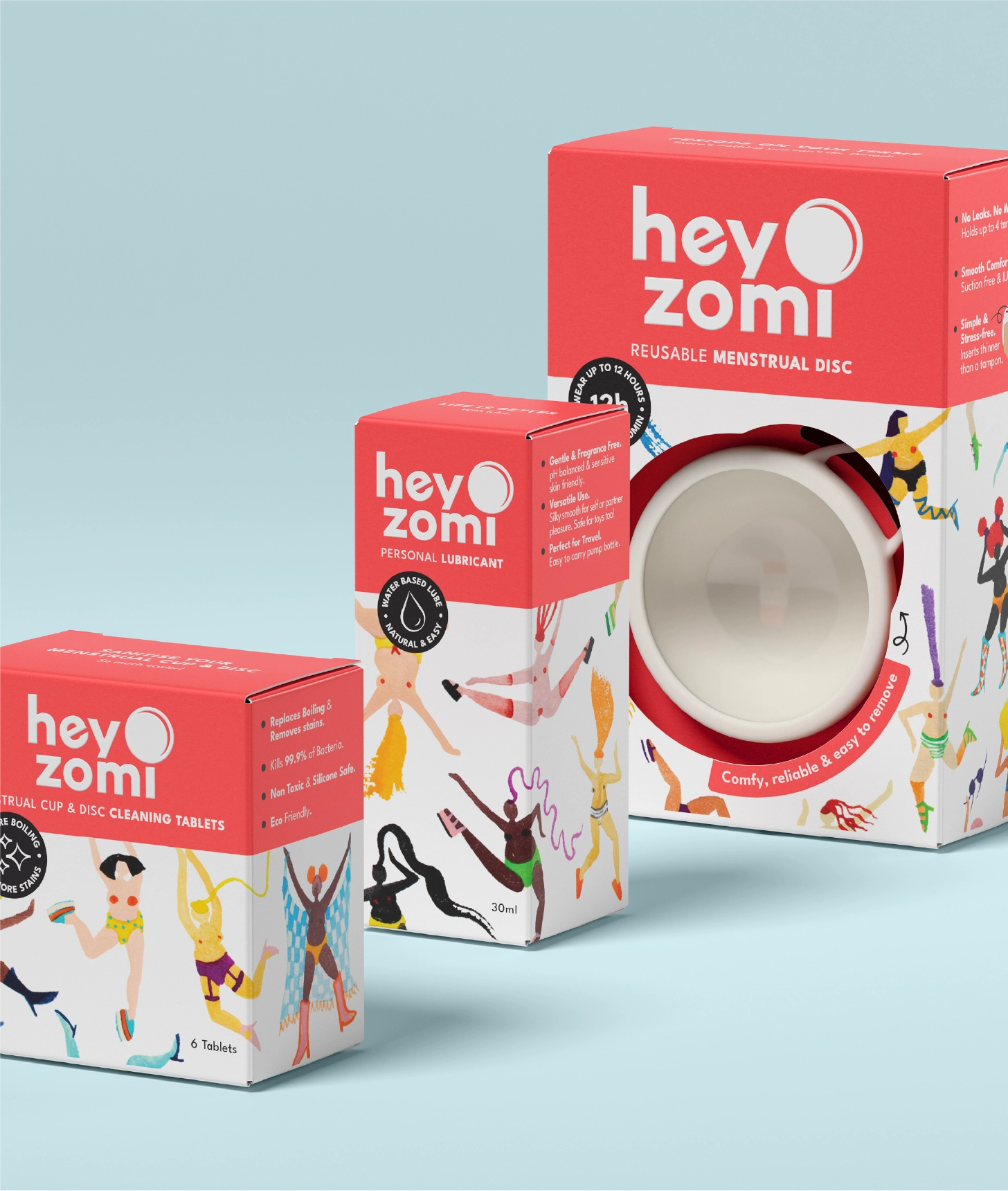
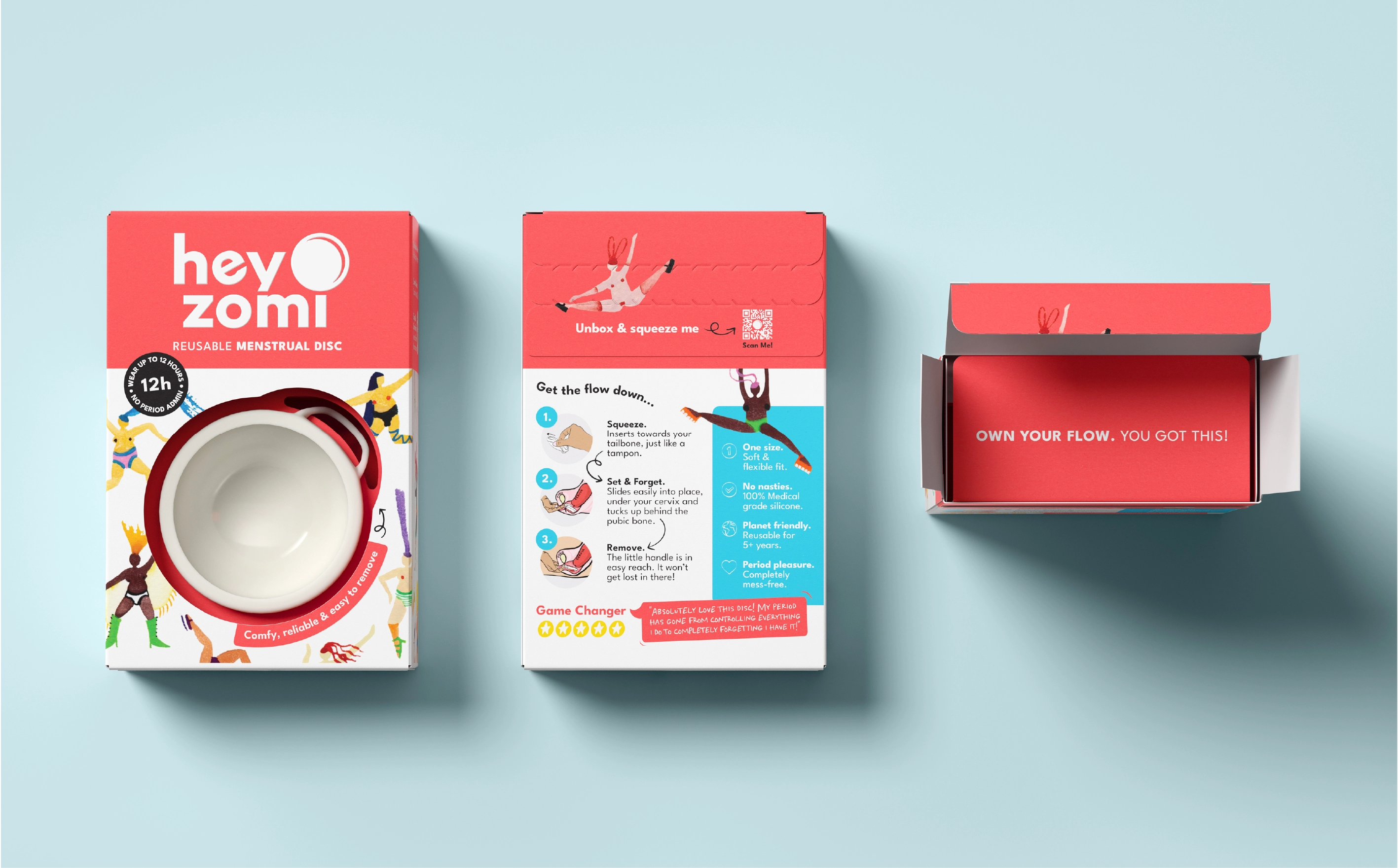
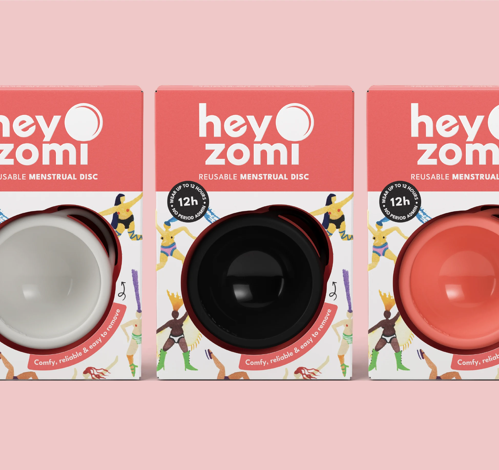
On shelf, the system establishes presence immediately. A bold coral red and an illustration style celebrating diverse femmes across body types, skin tones and lived experience cut through a category still dominated by black and pastel palettes. Real bodies in motion, everyday and unapologetic, define a visual language rooted in inclusion without idealisation.
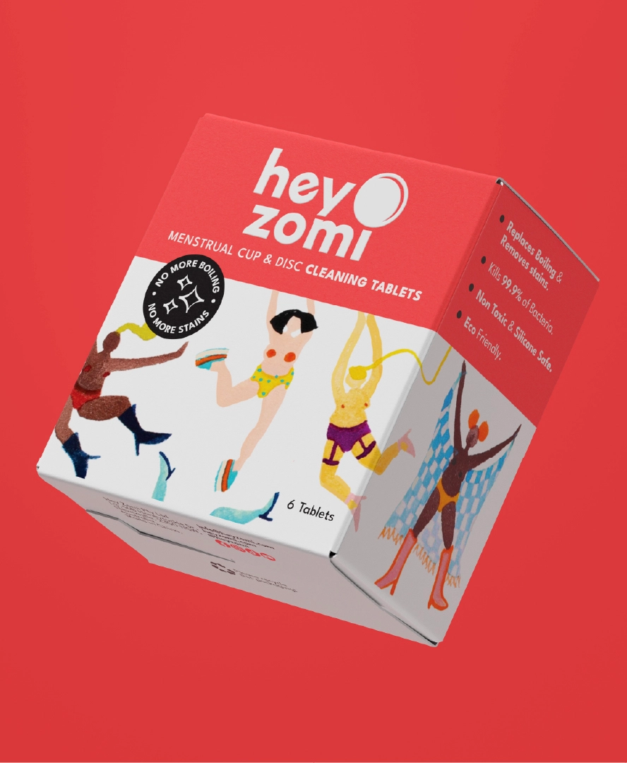
Brand and product naming lead. Educational copy and benefit claims are structured for rapid scanning, supporting clear shopper navigation across menstrual care categories including reusable menstrual discs, period underwear and cleaning tablets. The illustration wraps the pack, creating a cohesive block that builds strong recognition across the range. The brand mark is finished with a spot UV, adding a subtle layer of tactility and contrast against the matte pack.
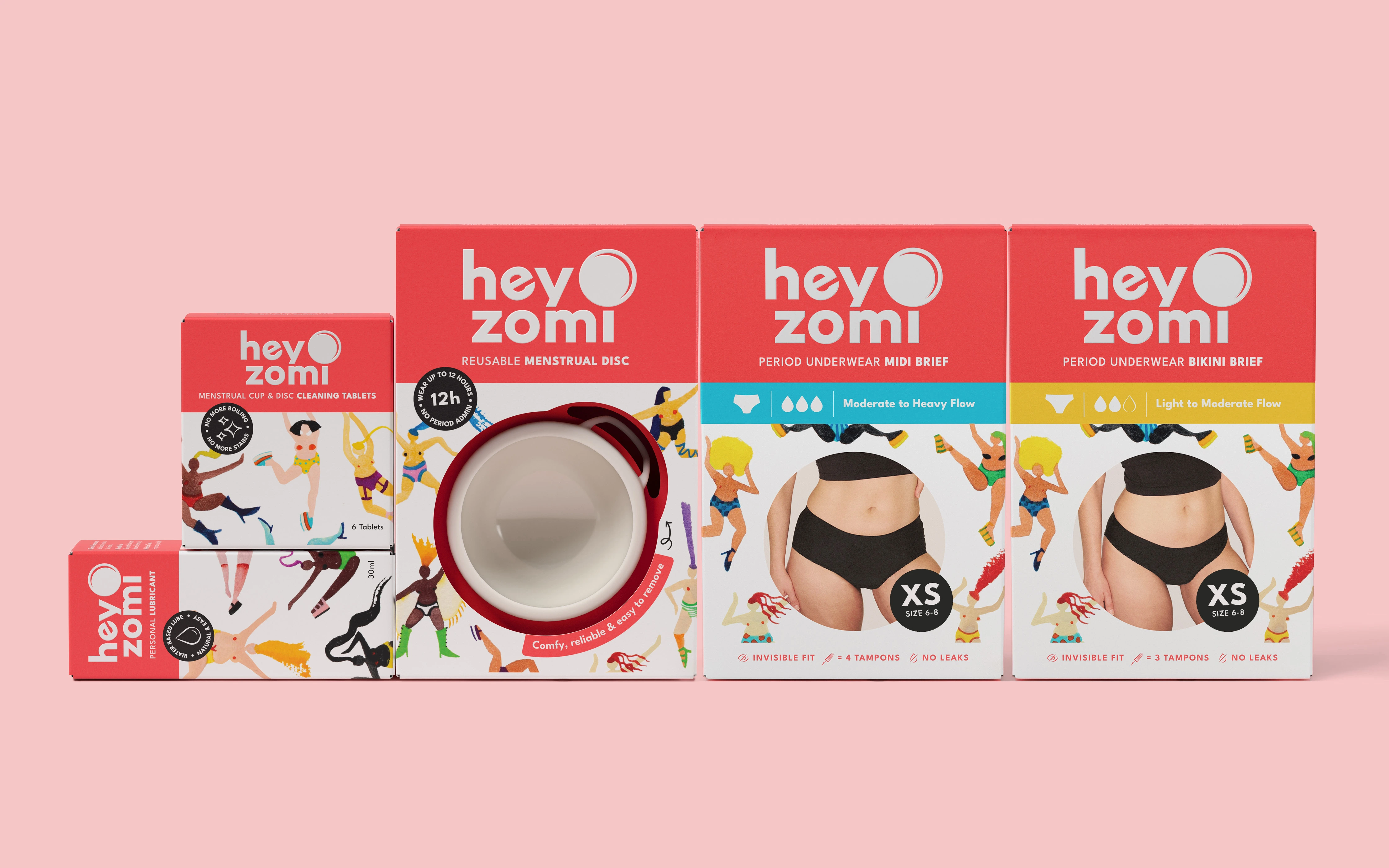
The system extends seamlessly across cleaning tablets, personal lubricant and period underwear, maintaining a rigorous brand architecture. Bold coral red capped boxes anchor the range, ensuring consistency from first encounter to product in hand.
Period disc packaging and underwear are intentionally retained within a consistent box format. This supports a uniform shelf presence while improving inventory efficiency, packing and distribution. The underwear introduce a coloured band to differentiate styles and absorbency levels at a glance, aiding quick shopper navigation while maintaining a cohesive system.
The result is a brand world that is cohesive, legible and highly functional. Every touchpoint is clear, confident and unified.

From D2C packaging to
retail shelf ready design.
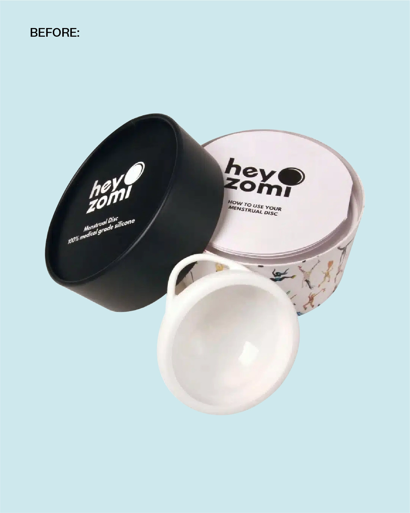
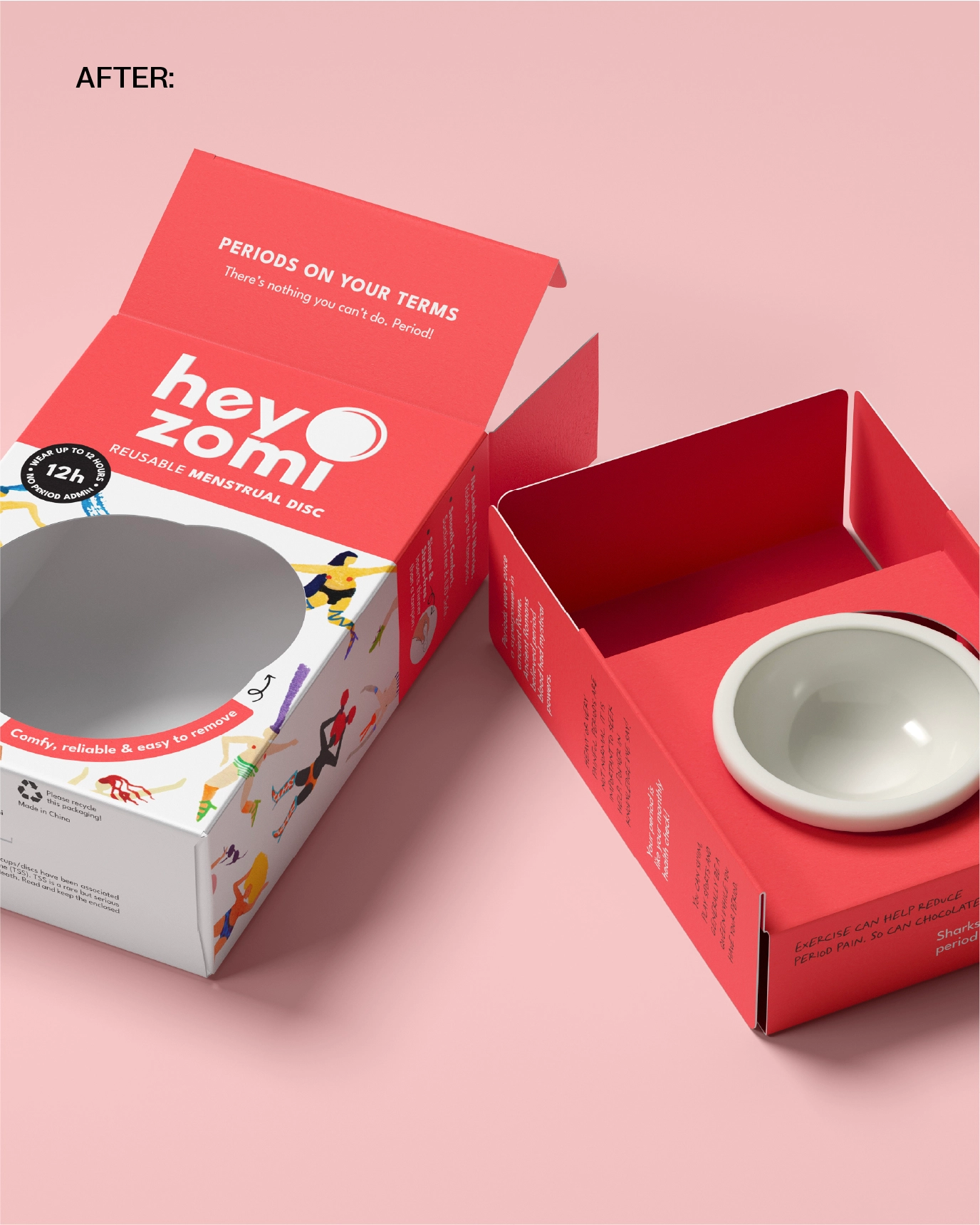
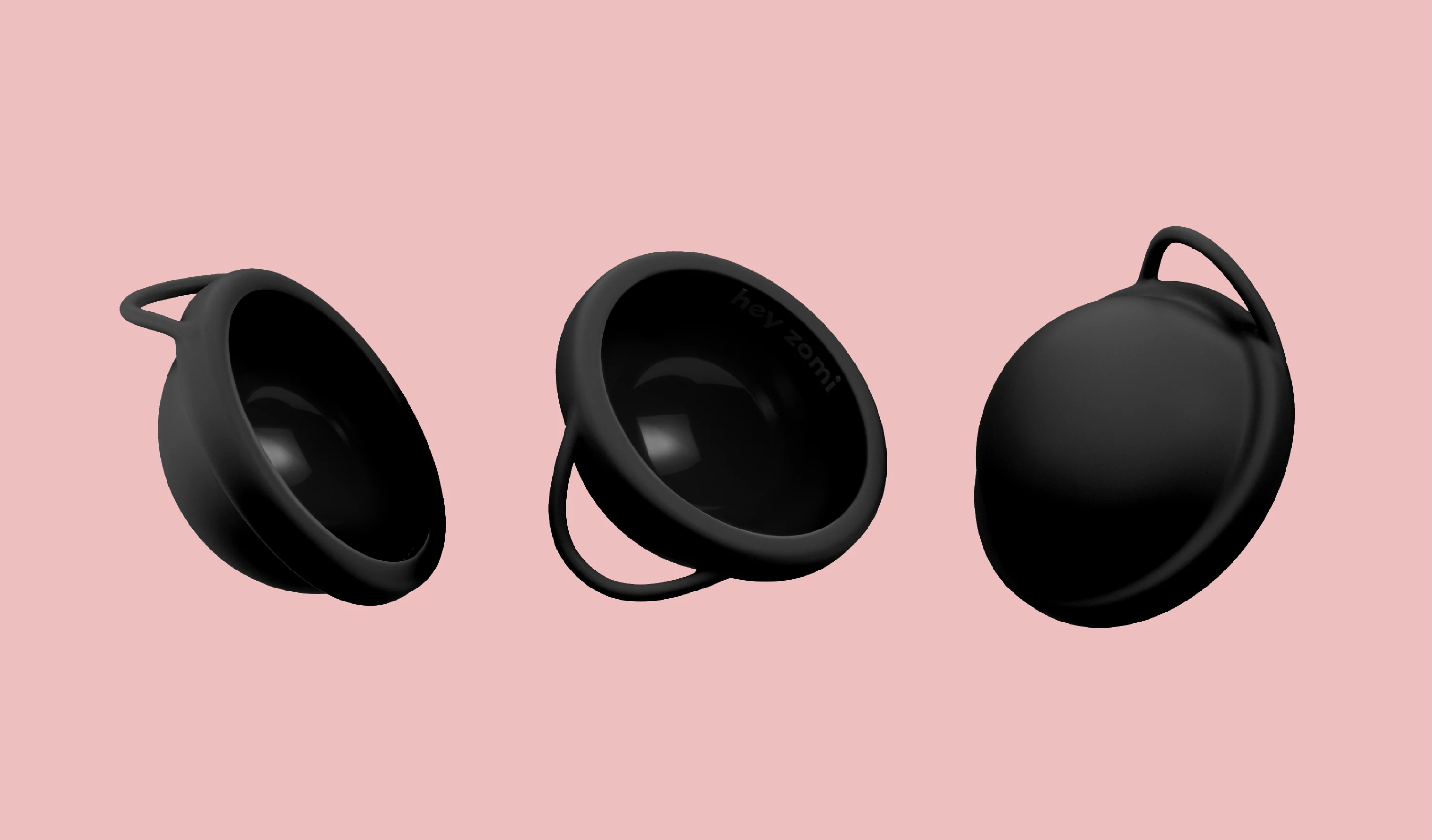
Depot was commissioned by Hey Zomi to design their FMCG packaging for their menstrual disc, a product that challenges convention and required packaging to do the same. The brief spanned cardboard engineering and brand architecture, with the ambition to create a system that performs at shelf while holding true to the brand’s values of sustainability, empowerment and radical openness around period care.

Expertise:
Awards: