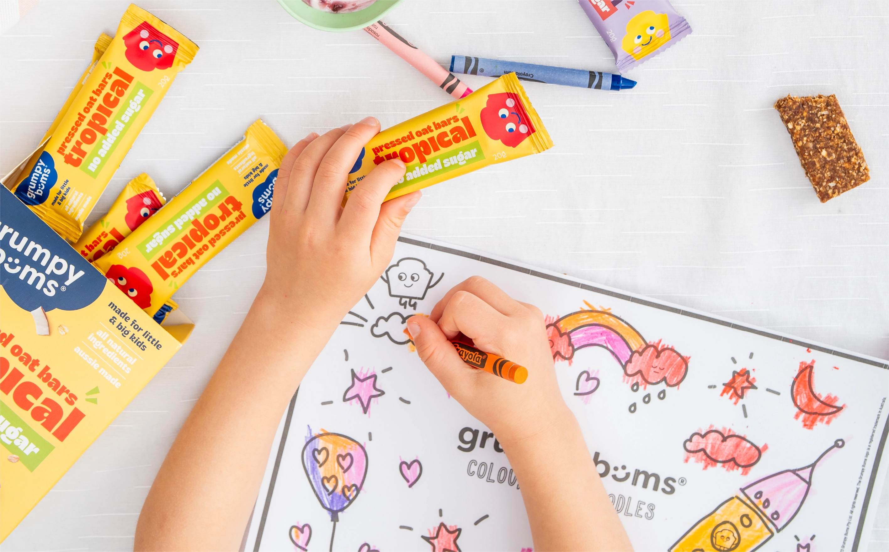
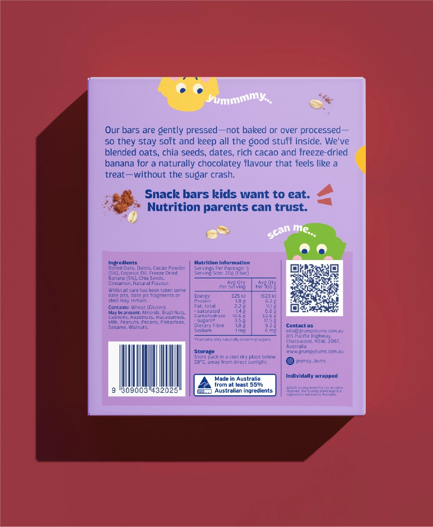
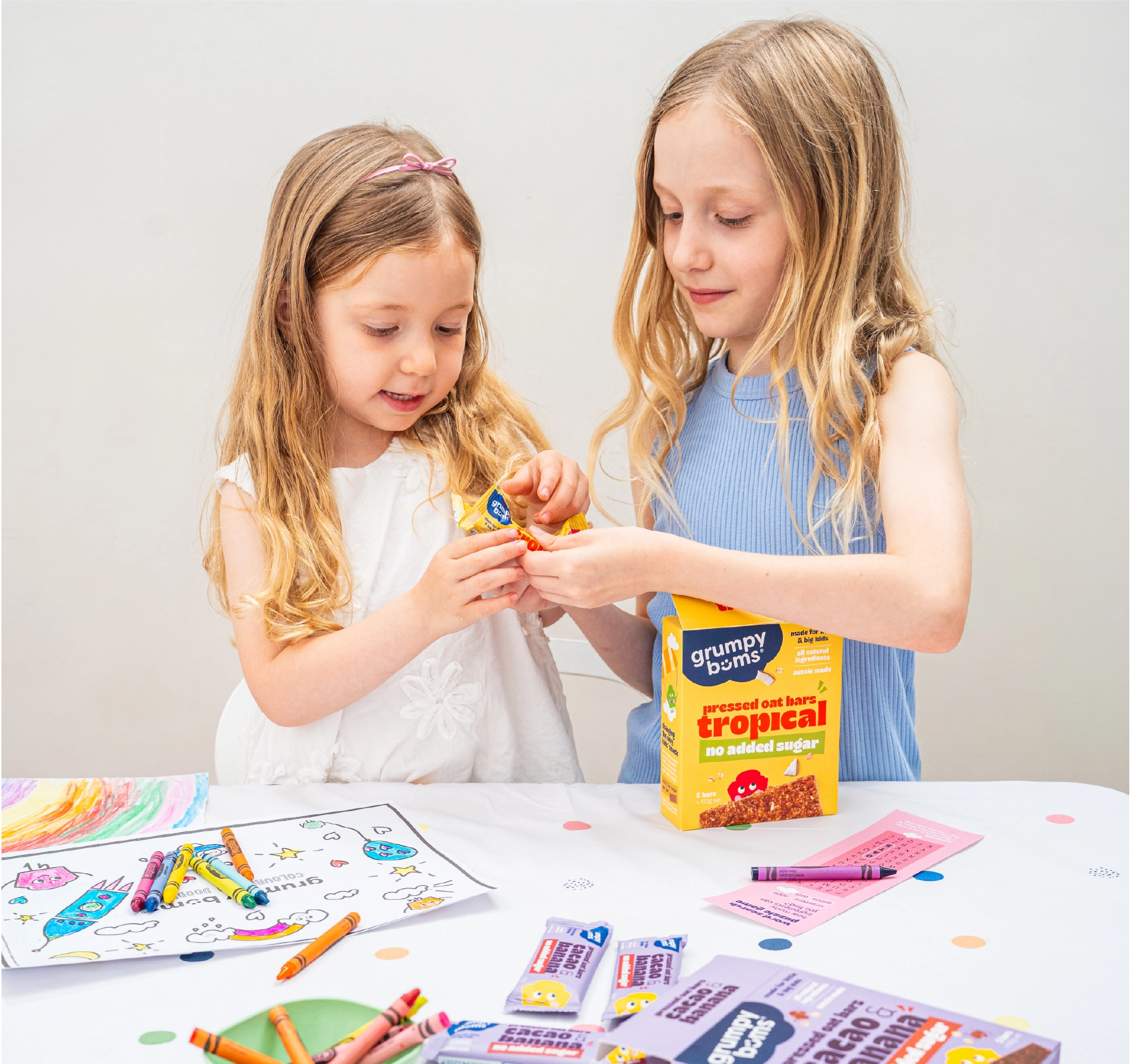
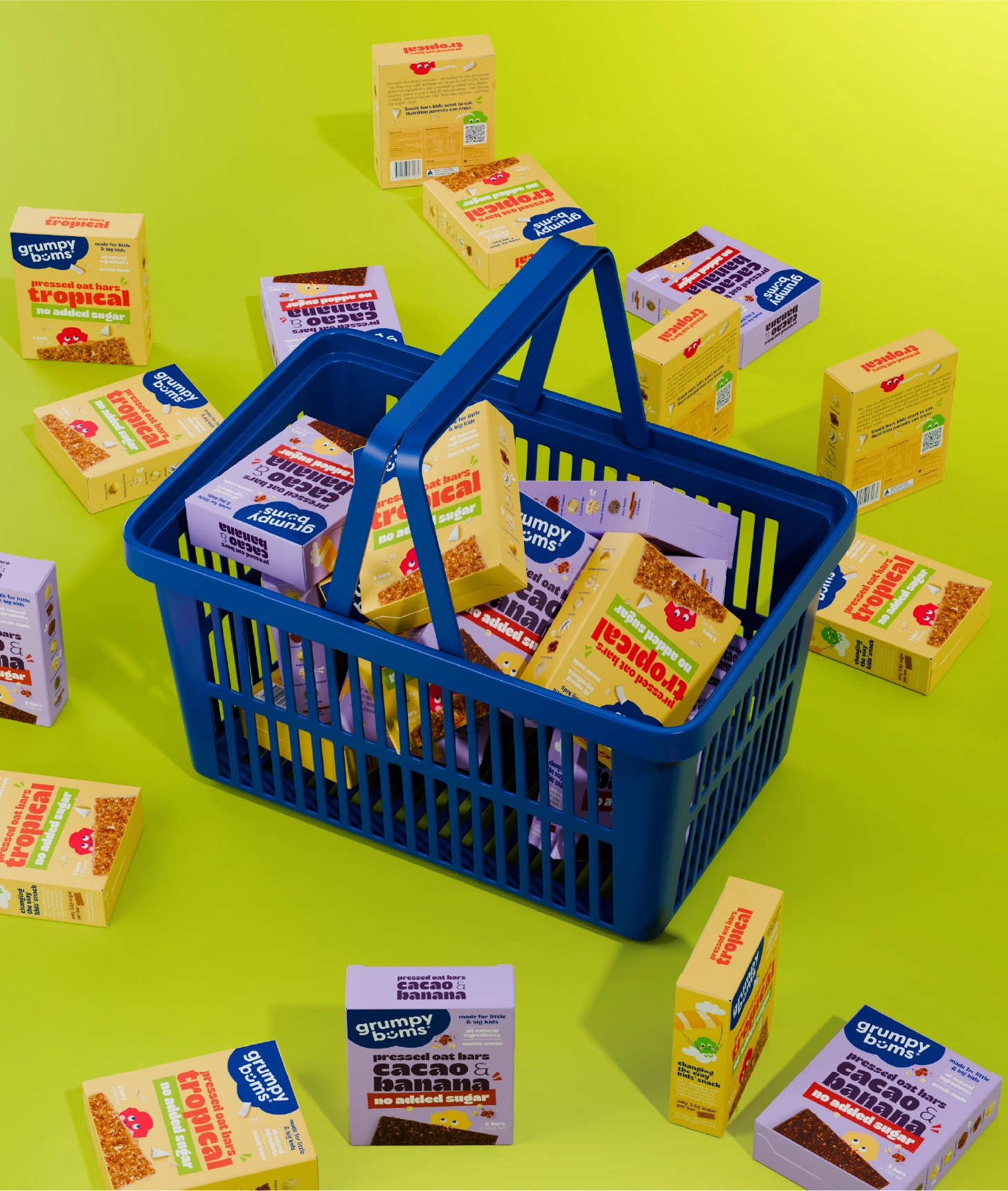
For Grumpy Bums bars, the challenge was to speak to two audiences at once. Parents are scanning for no added sugar. Children are responding to character and play. One wrapper, two motivations, both needing to be immediate and clear.
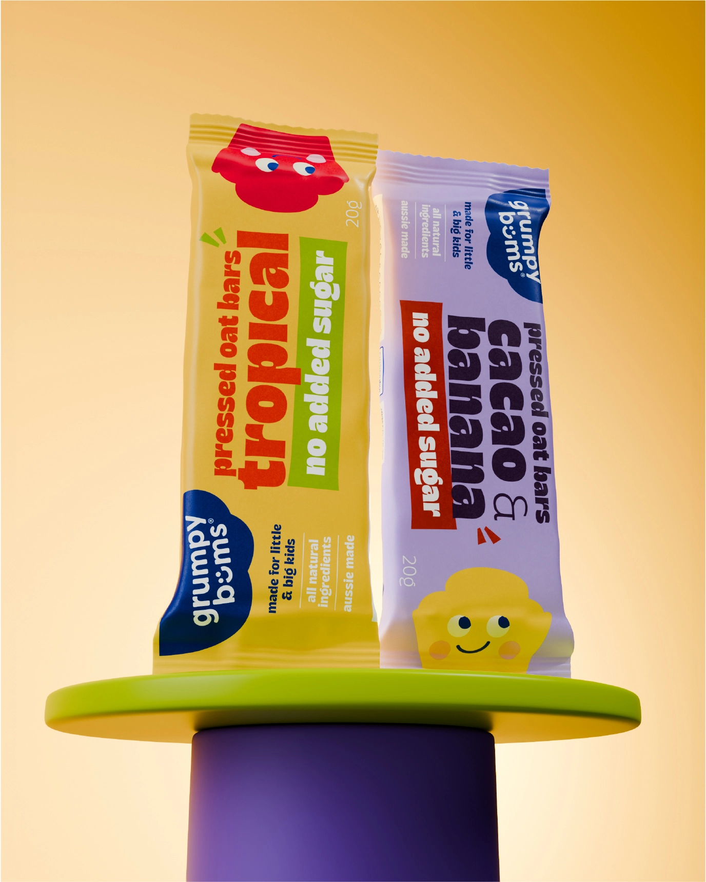
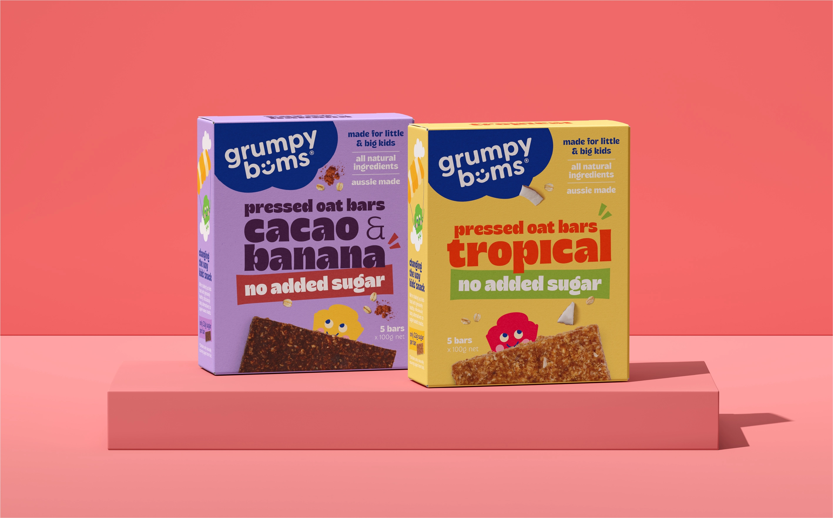
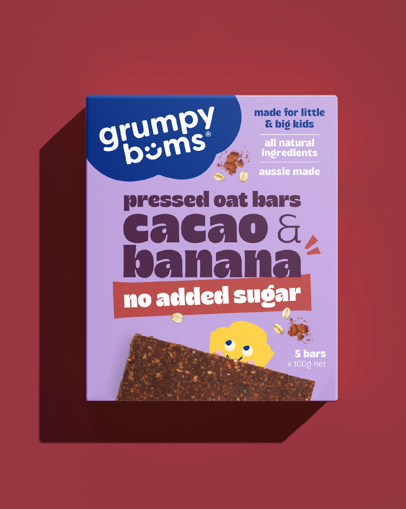
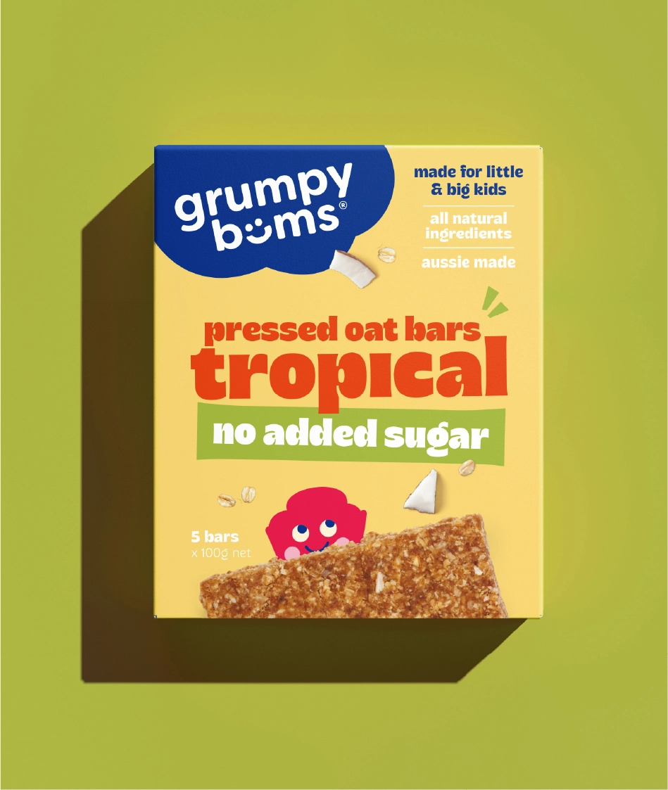
Each element is assigned a defined role within the hierarchy. Flavour-led typography carries primary read, designed to register quickly at distance and in motion. The no added sugar message is positioned as a direct reassurance for parents, clearly visible and unambiguous at point of scan.
The Grumpy Bums characters introduce the emotional layer. Hand drawn in house, they bring personality and recognition to the range. They are designed to create instant connection for children while supporting differentiation across variants. Supporting claims including made in Australia and all natural reinforce parental confidence.
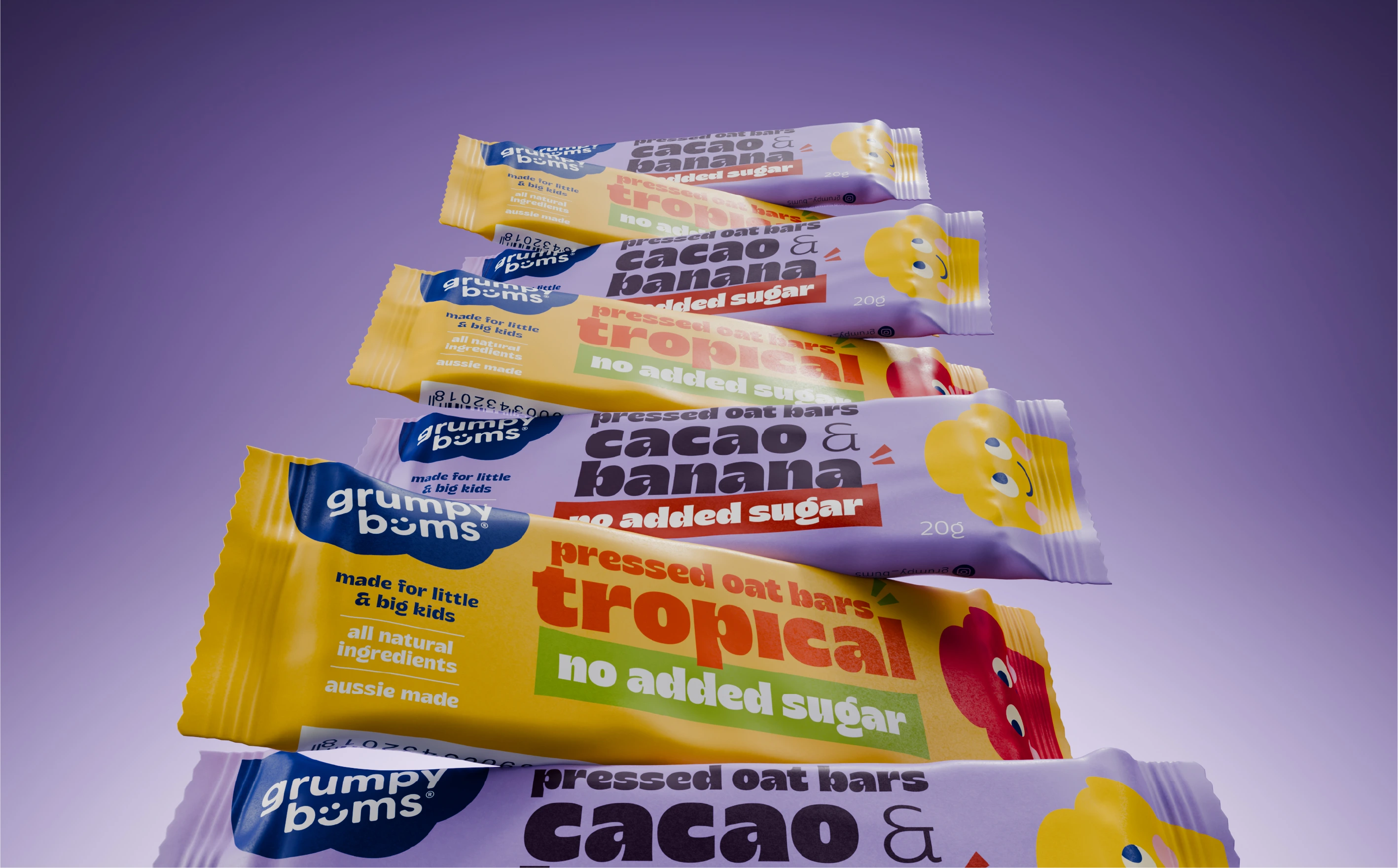
Colour is used as a structural tool across the range. It creates clarity at shelf, enabling quick navigation between flavours while maintaining a consistent system across SKUs. The result is a unified family with clear internal differentiation.
The shift from D2C to retail is not a reduction of design. It is a reconfiguration of hierarchy, messaging, and function to perform within a retail environment.

Two audiences.
One wrapper.
Zero wasted space.
Effective kids’ packaging is a balance of attention, trust, and appeal, delivered within a limited space. Moving from D2C to retail increases the demands on the system. The brand narrative is no longer experienced across a digital journey. It is compressed into a single moment on shelf, in motion, under time constraints.
Expertise:
Awards: